Wine and Art Pairing

art and wine pairing
Part of my mission statement is wine education. The best way to do this, is by comparing wine with things in our world that we already know. It is an abstract concept which I believe will help people understand the fundamentals about wine. it is easy for us to do wine and food pairing, wine and chocolate pairing and now, wine and art pairing. Wine goes beyond the realm of just what it tastes and smells like. The idea behind wine and art pairing is to look at wine as it affects us emotionally. Like art, wine can evoke emotions and create an experience or vice-versa It can create an experience which leaves a lasting impression. Taking a closer look at the two we can learn more about the basics of wine and art pairing and see how their fundamental elements relate to each other.
The basic idea behind wine and art pairing is to look at the basic fundamental elements of wine and those of art and compare them with each other. Each element creates a certain experience. We will pair those experiences or emotions to each other. Are you with me yet? Not to worry, you’ll catch up; lets first learn the basics of wine and art.
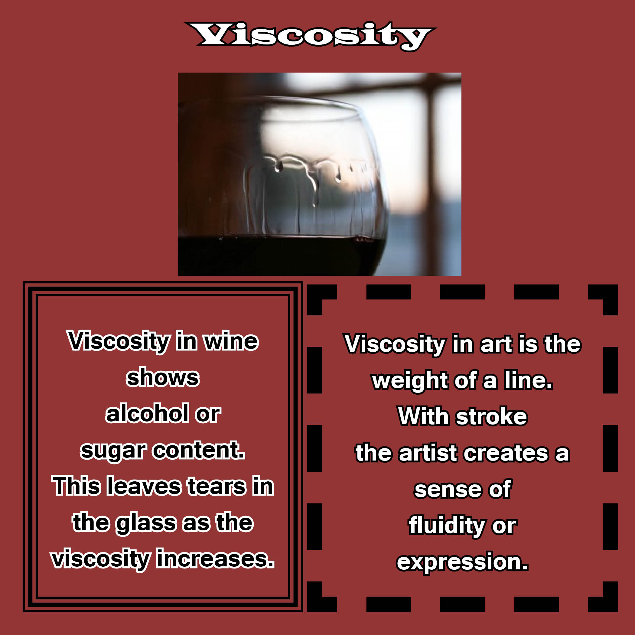
Viscosity
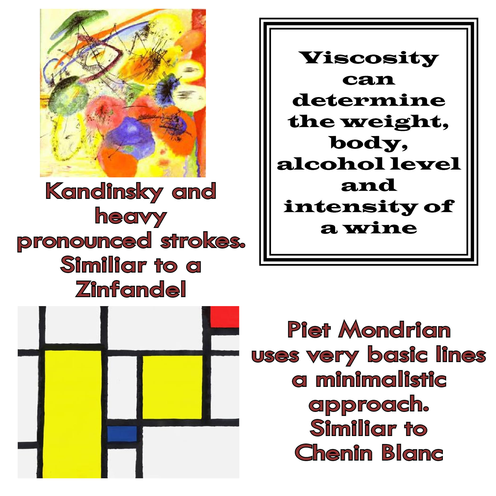
A wine’s viscosity is measured by the tears and staining of the wine on the wine glass. I compare this to the weight of a line in art. Viscosity can tell us about the alcohol or body of a wine, the lines in art do the same, they give weight to the work. A thin light line gives an art work a feeling of being light and whimsical; where a heavy and dark line gives a bolder and pronounced feeling. A wine’s viscosity can do the same. A wine of light viscosity might be a Pinot Noir, light on the palate. A wine with more viscosity will have more alcohol and give the wine weight and body, becoming bolder. The first step in wine and art pairing is matching the wine’s viscosity with the weight of the line.
Color
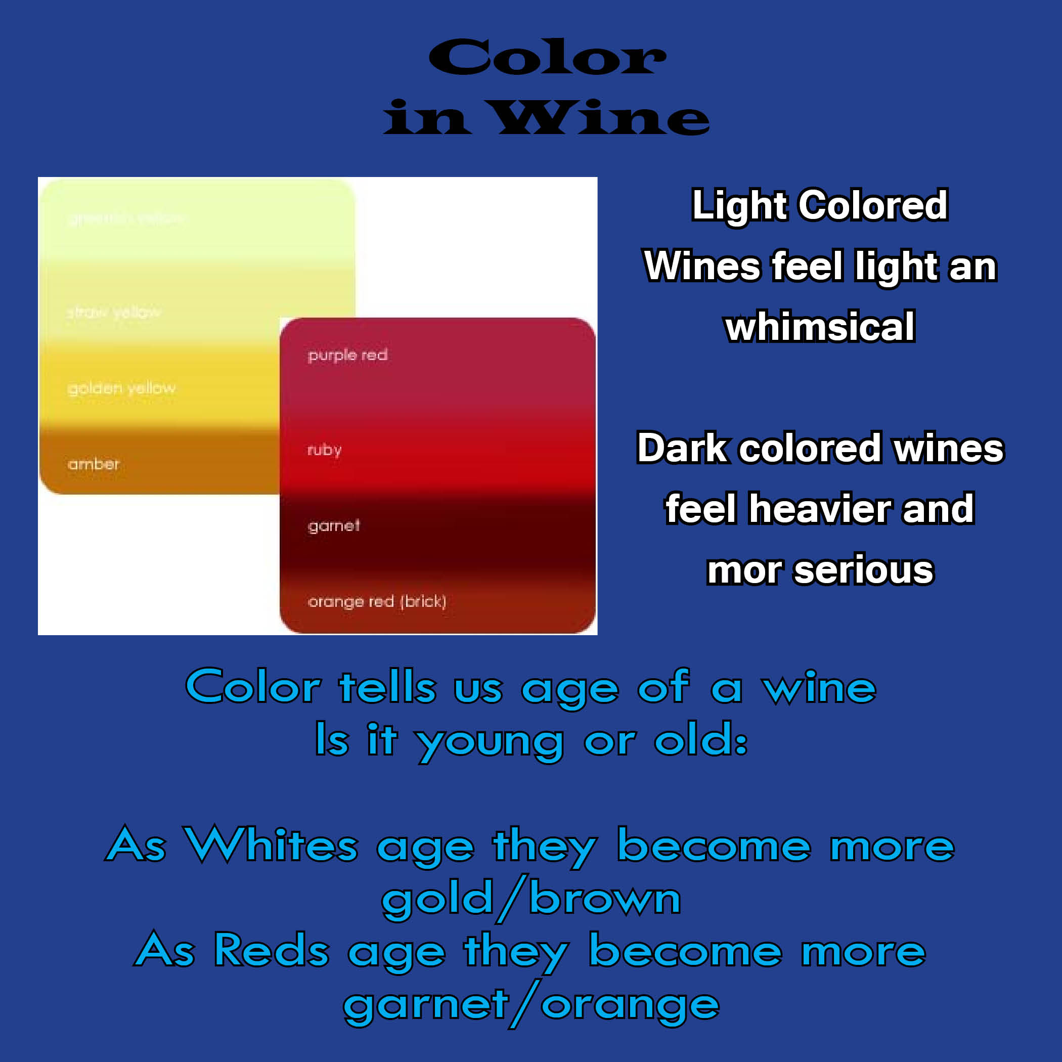
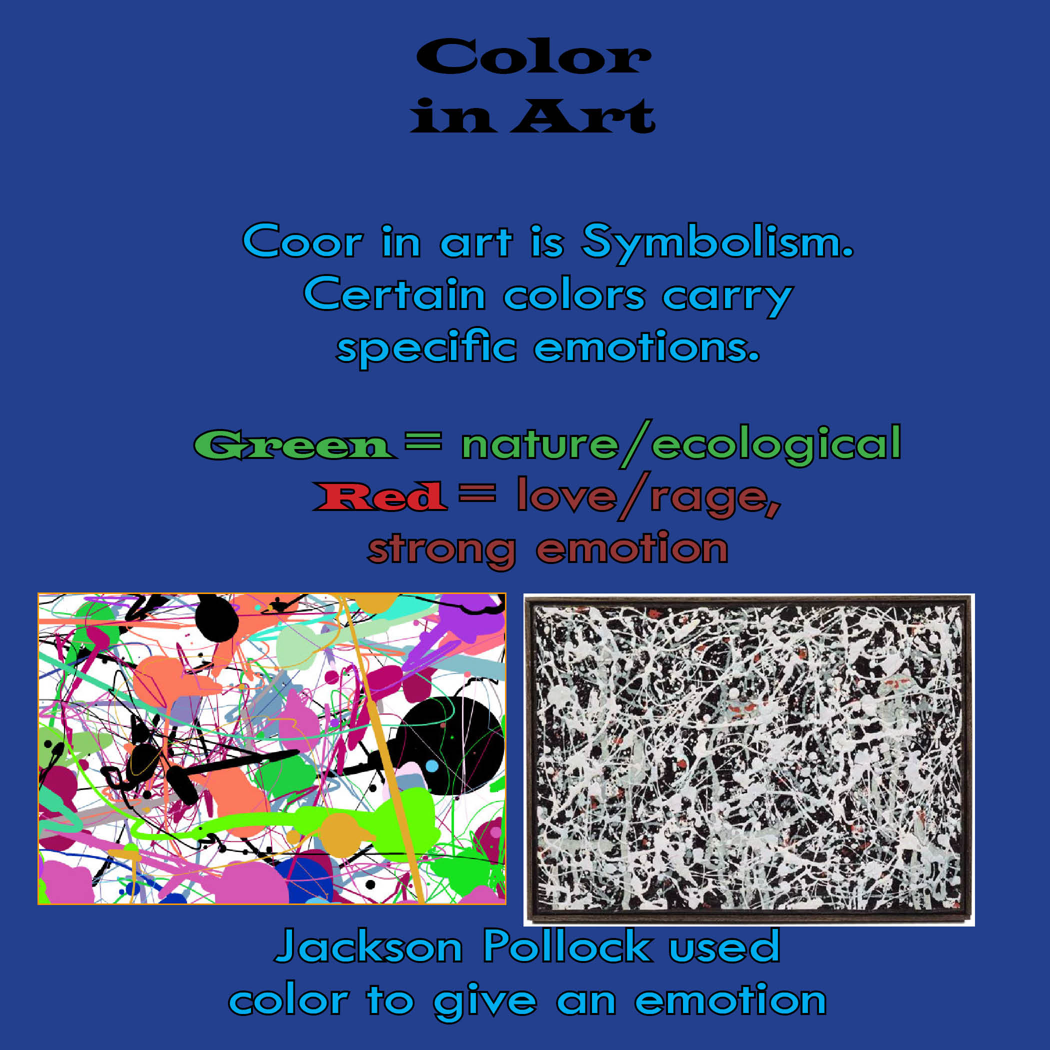
Color has a direct influence on ones emotion. An artist uses color to either make the work pop or remain subdued. Specific colors have specific meanings. For example, today, green means ecology, while red is a strong emotion denoting either love or hatred. In wine, color gives us the first clues to what the wine will be like. Dark color usually means heavy and full. A light color is light bodied and clean.
When making an art and wine pairing, a wine such as a Syrah or a Cabernet which have a rich deep color, can pair with works of art that have a dark side, or a heavy emotion. Lighter colored wines such as Gamay or Pinot Noir, pair with more lively and whimsical colors. The color of a wine can also be an indicator of a wines age. If there is a disparity between the center of a wine to its rim, it might be a sign of age. The wine goes from dark to light, but the difference is a lot more noticeable in an older wine than in a young wine. This being said, some older wines can pair with works that are rustic and younger wines with more bright and vibrant colors.
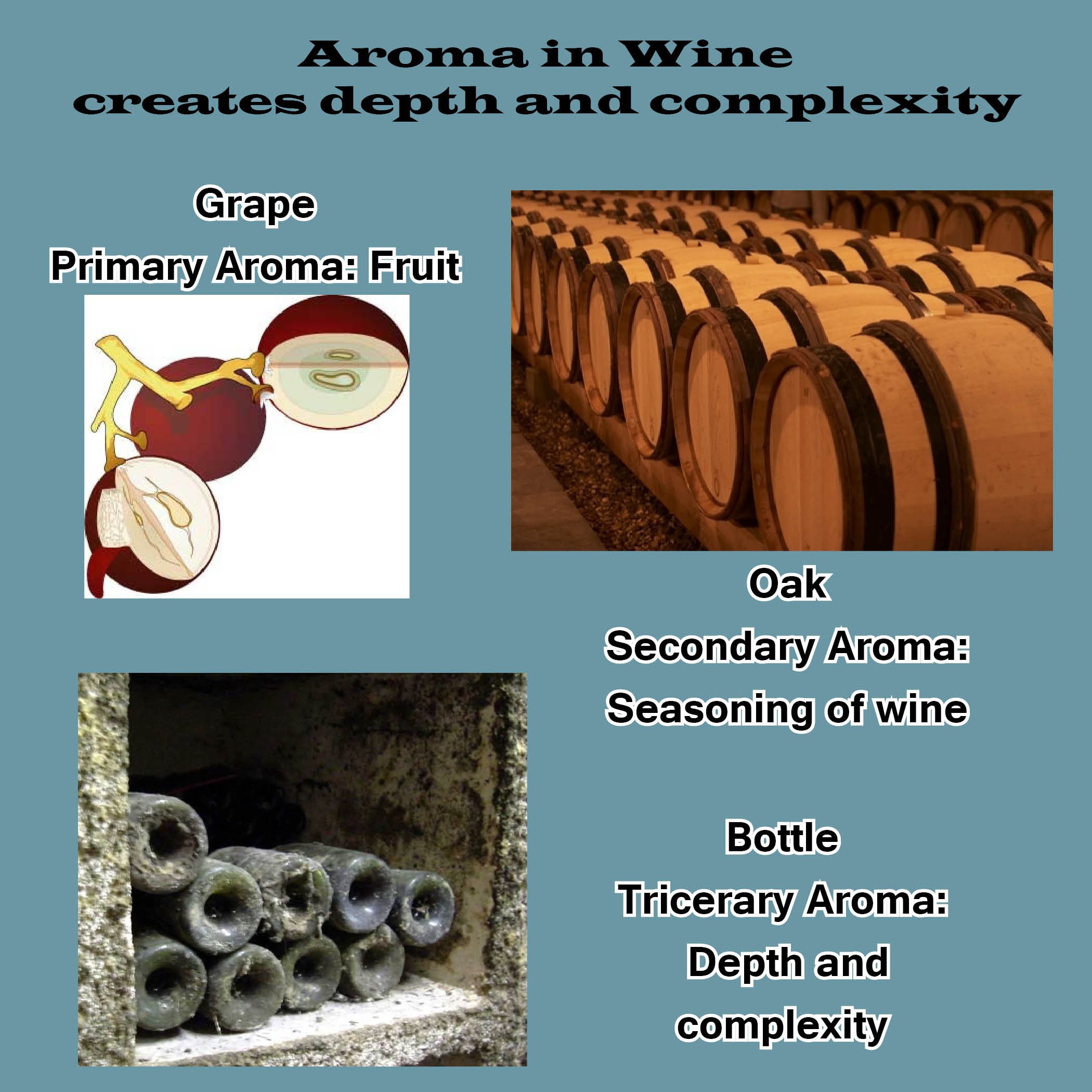
Aroma and Brightness
In wine and art pairing aromas can be compared to the brightness of a piece. Aromas in wine can be construed as being very aromatic such as a Viognier, or more subdued, such as a Chardonnay. A wine with a fruity aroma is usually a wine that will land bright and lively on the palate. A wine with an aroma of oak and earthy aroma will usually be less bright on the palate and better with food. In art Brightness is the art’s intensity. Does it pop or is it subdued? Does the artist play with light and dark. Are the hues in harmony or in contrast?
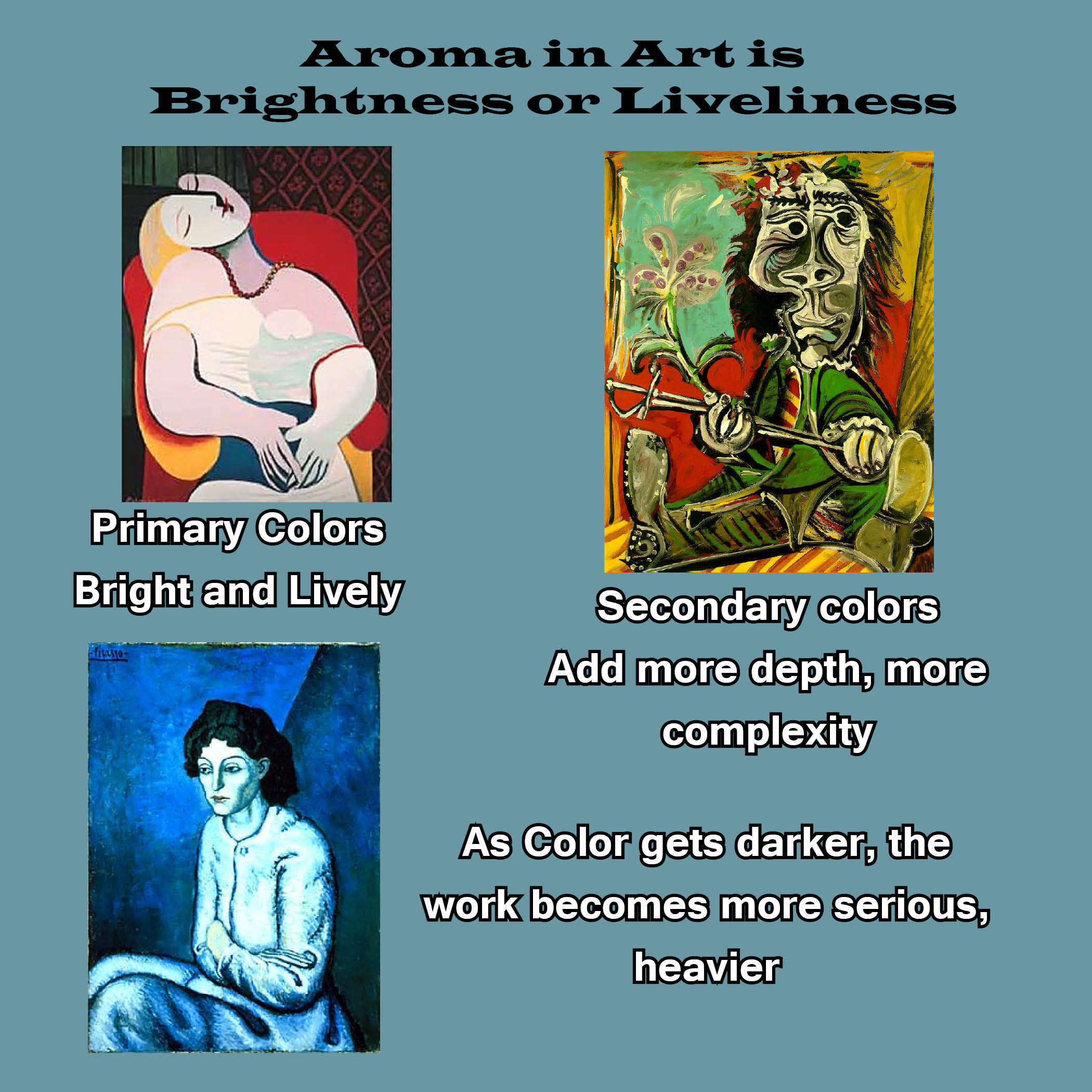
We group colors into primary and secondary. From there the artist plays with light and darkness. Wine aroma is also divided up into primary, secondary and tertiary aromas. The type of grape, the soil from where it grew or what the wine maker chose to do in the wine room are an major influence. The aromas will give a wine a sense of brightness or dullness.
Primary colors are yellow, blue and red. Primary aromas are fruit aromas and come from the grape itself. Secondary colors are green, purple and orange. Secondary aromas come from the aging vessel and can smell like butterscotch, toast, vanilla, char or cloves. Tertiary colors are black, brown, and colors mixed with white. Tertiary aromas come from bottle age and can be aromas of leather, smoke and earth. As we learned earlier, color effects emotion. Color and brightness are almost inseparable. A work’s emotion is just as much influenced by the brightness as by the color. The brightness of a wine is also influenced by its color and its aroma. So when comparing wine and art, we really cannot separate color from brightness. Many times the color of wine is overlooked, but as you can see, it is an essential part of wine and art pairing.
Looking at the figure below, we can pair the different styles of Picasso with wine. The 1st piece is composed of mostly primary colors and can be compared to a fruity white, such as a Riesling Spätlese from Germany or a Vouvray Demi-sec. Both are lively and bright. As for a red, a Beaujolais Noveau or California Zinfandel would work, because they are all about fruit and primary aromas. The second piece is a bit more intense and the palate now includes secondary colors. A wine with some oak usage will start to showcase those secondary aromas. Because of the heavy lines and complexity of the piece, I turn to an Argentinian Malbec which still has plenty of fruitiness to match the simpler color palate. A Malbec which has the use of American or French oak is a bit more complex and matches the secondary colors and heavy lines. Finally, the “Blue Series” Picasso might be monochromatic, but if we look at brightness it is much more subdued, the color palate is introducing blacks and dark blues and it is much less bright than the other pieces. An aged Cote Rotie, with that bluish color of the Syrah, the berry and violet, pepper and leather aromas has a deep complexity of all three aroma types and makes a likely pairing.
Taste and Complexity
A wines complexity is determined by the influence of oak, acidity, the balance of fruit, secondary and tertiary aromas and flavors. Complexity is based on the package and how it comes together. It all comes down to the overall taste. Too much complexity can be off-putting and too simple is boring. Complexity of art is very similar. A complex piece of art can have more than one element. It can have different media types, complicated themes, 3 dimensionality, super intricate or just “a lot going on”. When it comes to pairing, we look at the taste of the wine and pair with complexity of the piece. A wine with oak is more complex than a wine without. A painting with mixed media can be more complex than a pen and ink drawing.
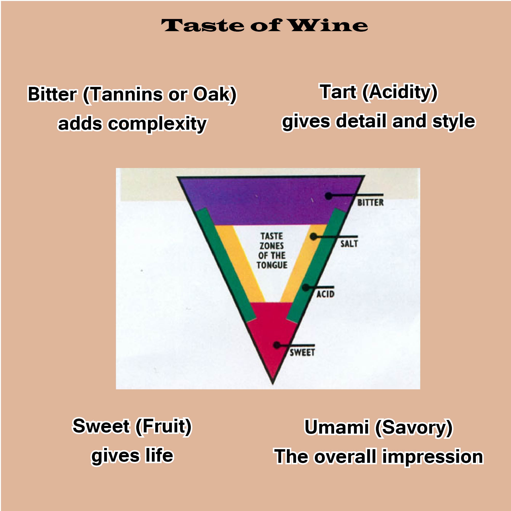
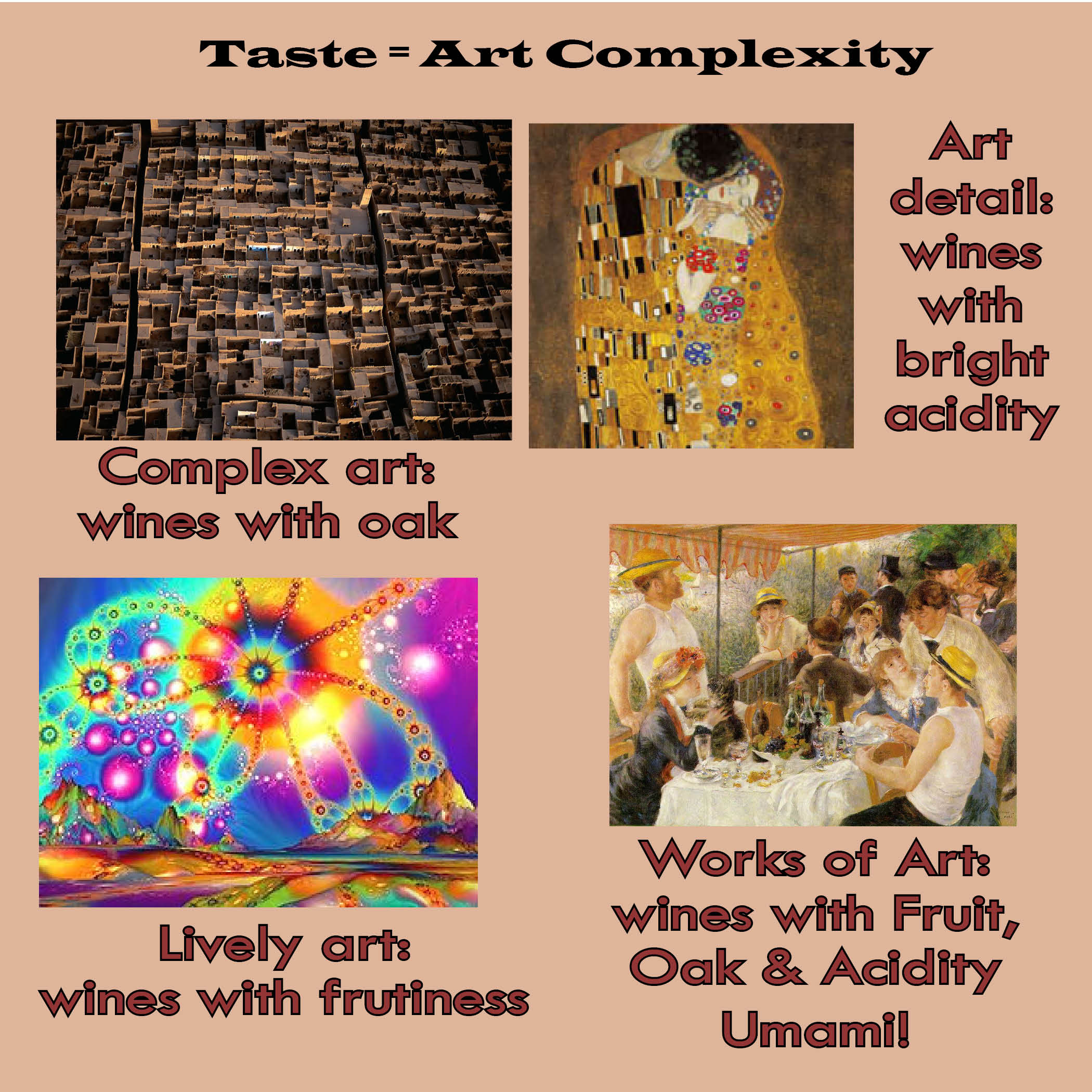
To find a wine’s complexity, we need to know our tongue. Taste is divided up into bitter, tart, sweet, salty and umami. Wines which have all components are complex. The sweet is influenced by the fruit and alcohol, the bitter by oak and tannin, tart by the wine’s acidity and umami is the grandiose overall texture. Some wines might come across as salty, but not a necessary part to value a wines complexity.
When it comes to making a wine and art pairing, we look at the works complexity and match it with the wine’s complexity. If the wine is a fruity Zinfandel, it might be all up front on the tip of the tongue and very little on the back? If so this would probably pair well with a psychedelic painting from the 60’s, colorful and bright but not very complex, just repeating patterns. Maybe you have a Pinot Noir from Nuits St. George. Now we are getting a bit more complex, bright but a sense of minerals. A wine such as this pairs with a classic work, such as a Degas. A soft flowing painting of ballerina dancers, complex in light and brush stroke but not overly complicated. Finally we take a wine such as a Brunello di Montalcino from a good vintage. The wine has fruit and licorice aromas; it has a fair amount of tannin and great acidity. The texture is silky and has body and depth. This is a much more complicated wine and can pair with more complex art works. For example, a Salvador Dali would be excellent. Although his work is not mixed media, it is complex of design and theme.
Wine body and Weight of Color and Theme
In order to understand this concept we have to know how to figure a wine’s body. The body of a wine is a direct connection to the level of alcohol. Higher levels of alcohol can give more body to a wine. The body is sensed in the mouth; how does the wine feel in your mouth? An easy way to understand a wine’s body is by comparing it to milk. Does the wine feel like non-fat, whole milk or cream. The weight of a wine can be compared to a works color and theme. Lighter colors are light bodied wines and darker colors are full bodied wines. The theme of the piece is also paired to the body of a wine. A whimsical one note painting can be paired with a light body wine. Whereas, a piece that has some social commentary on the holocaust will work best with full-bodied wine. What it really comes down to is the emotion the theme has on us, which will ultimately decide the body of the wine you wish to pair.


Wine Texture and Media Type
In art, texture can be determined by the surface of the piece. Is it a pen and ink on white smooth paper or is it a Indonesian wood carving? A piece with a lot of texture can also be on a smooth surface. Take two photographs below, one is an Ansel Adams photo of sand dunes and the other is an Ansel Adams of a dried and cracked desert floor. Both are printed on the same paper, however the subject gives the texture to the work of art.
Where does wine get its texture from? Or better yet, how do we decide a wine’s texture? Texture is all about the mouth-feel. Is the wine silky and soft on the tongue or is it abrasive and disjointed? One of the main factors in creating mouth-feel is a wine’s tannin levels. Tannins are the prickly dry feeling you feel on your cheeks and lips. Tannins are caused by the skins, seeds and stems of the grapes. Certain grapes have a lower tannin level and others are very high. If you look at a cup of coffee and compare the difference between a black coffee and a cappuccino, you will see a difference in texture. The black coffee is tannic and more acidic and the cappuccino is creamy and soft, virtually not tannic nor acidic. In wine a Pinot Noir is a thin-skinned grape which has low tannin levels. A Cabernet Sauvignon is a thick-skinned grape and is a lot more tannic. Pinot Noir is usually described as silky and velvety, whereas Cabernet Sauvignon is described as big and chewy.
In the figure below you see different types of art works and each has a different texture. The texture can be created by the artists choice of brush stroke or the artists choice of subject. The Palate knife painting makes a good pairing with a Chateauneuf-du-pape. It has a mixture of grapes creating layers of texture on the mouth. The Grenache gives heat on the tongue, the Syrah is silky and plush and the Mourvedre has a rustic tannin. The image of Natasha Kinski is very soft and silky. So an obvious pairing would be a Pinot Noir, but what about a dessert wine? A Sauterne which is rich and velvety, sweet but not cloying and finishing crisp, is also a great wine and art pairing.


A Wine’s Finish and an Art Work’s Lasting Impression
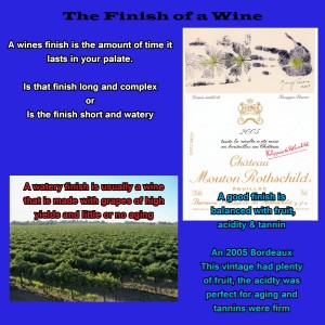
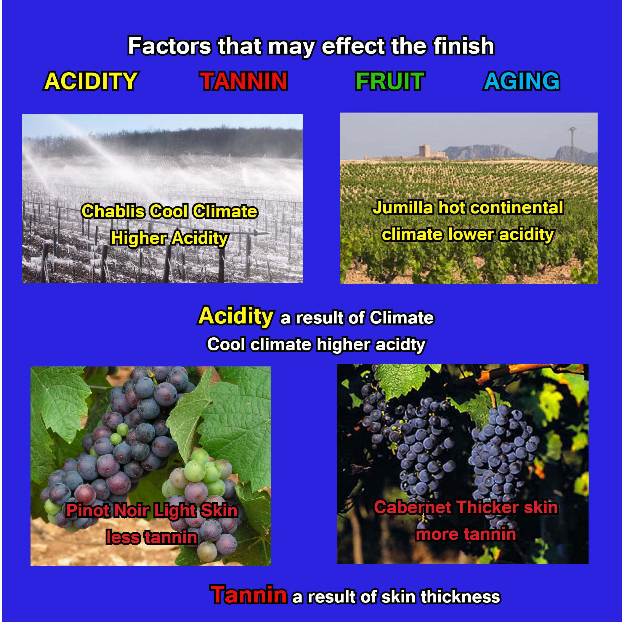
The last concept in wine and art pairing, is the wine’s finish and the art work’s lasting impression. A wine’s finish is it’s lasting impression. The factors responsible for a wine’s finish are acidity, tannin, fruit and age (time opened). The finish can be pleasant or unpleasant. An unpleasant finish is usually a result of a wine out of balance and finishes bitter and/or overly acidic. A wine of great quality has a finish that is long-lasting and hangs on with complex flavors of oak, fruit balanced with acidity. When these components come together in harmony, it is a great experience.
A lasting impression for a work of art is subjective. Each person takes away a different impression based on their personal involvement with the piece. Each person views art through their own eyes and evaluates it based on their own experiences. That being said, we do the same with wine. I can sit here all day and rave about the complexity and the amazing finish of a 2000 Brunello, but for someone else it just isn’t their style. So how do I pair wine and art based on the lasting impression? You have to take the structure of the wine into consideration. Did the aroma, fruit, tannin and acidity all come together? If so, was the wine’s finish short or long? If I am viewing a piece that has some meaning and is thought-provoking. I will pair a wine that I felt had a long finish. If the piece was interesting yet easy to forget I’d pair with a medium finish. And if the work of art was of no interest and just a glimpse, I would not even bother drinking the wine with a short finish, why waste the time?


Wine and Art is Emotional
The key to wine and art pairing is understanding how to break down the two to their fundamentals. Both wine and art are rooted in our emotions. As we start to learn the fundamentals of each, we will start to understand why wine and art evoke certain emotions in us. A wine’s aroma and flavor can take us back in time to another place. Why is it that people have such an eye-opening experience when they travel to Europe and drink the house wine. They are blown away that the inexpensive wine is so good. But it’s really the experience that makes the wine taste so good. Sipping the wine that was poured from a clay pot is part of the experience which creates an emotion. Can this be duplicated back at home while drinking the same wine? Probably not. Wine is rooted in our emotions and our emotions are a direct result of our experiences.
Art is also rooted in our emotions, it can touch our hearts and drive us to tears or laughter. I remember sitting in front of Pablo Picasso’s “Guernica” at the Museo Reina Sofía. It was one of the greatest experiences in my life. The immensity, the drama and the color choice stirred emotions of sadness, courage and anger all at the same time. Will that feeling ever be duplicated when I see that painting again? Probably not. Just as sitting in a small restaurant outside of the Alhambra in Granada Spain, drinking a “joven” out of a clay pot will never be the same elsewhere. Art and wine are an experience. They affect and effect our emotional state. When it comes to making the pairing, we look at the fundamentals of each and decide a pairing by matching the emotional result of the art and wine.
So the next time that you decide to go to the museum, be sure to pack your bag with several bottles of wine and try your own wine and art pairing.
Click here to down load the complete art and wine presentation


3 Comments
Of Wine and Art | Brampton Wines
[…] https://www.mauricescru.com/ Share this:TwitterFacebookStumbleUponEmailMoreDiggLinkedInPrintRedditLike this:LikeBe the first to […]
Dorothy Franchi (Lindsay's mom!)
What an ingenious way to look at and learn about wine’s characteristics, especially as art is my absolute passion in life—wine I’m still learning about, but this I can really relate to! Art & Wine, great pair, great analogy, museum visits will never be the same! Love your wine blog, Maurice, you make it so fun, so personable, and your passion and knowledge is undeniable which makes for some very enjoyable reading! Really liked your ‘Sommelier’ article, written from the heart and very informative, plus ‘What Makes a Great Night,’ a successful restaurant has a lot to do with believing in its employees, you definitely get it, Maurice! And your wine descriptions, always feel that I can literally taste them! Thanks, Maurice and have a great time in Brazil! Hope maybe to see you come July when we’ll be at Thornton Winery for jazz and Escondido for the new Vintana!
Maurice
Hope to see you when you come to San Diego, we might be doing an Art Show and Wine Sale during that time. Thank you for the kind comments.